
Case Study: Enamel & Mint Dental
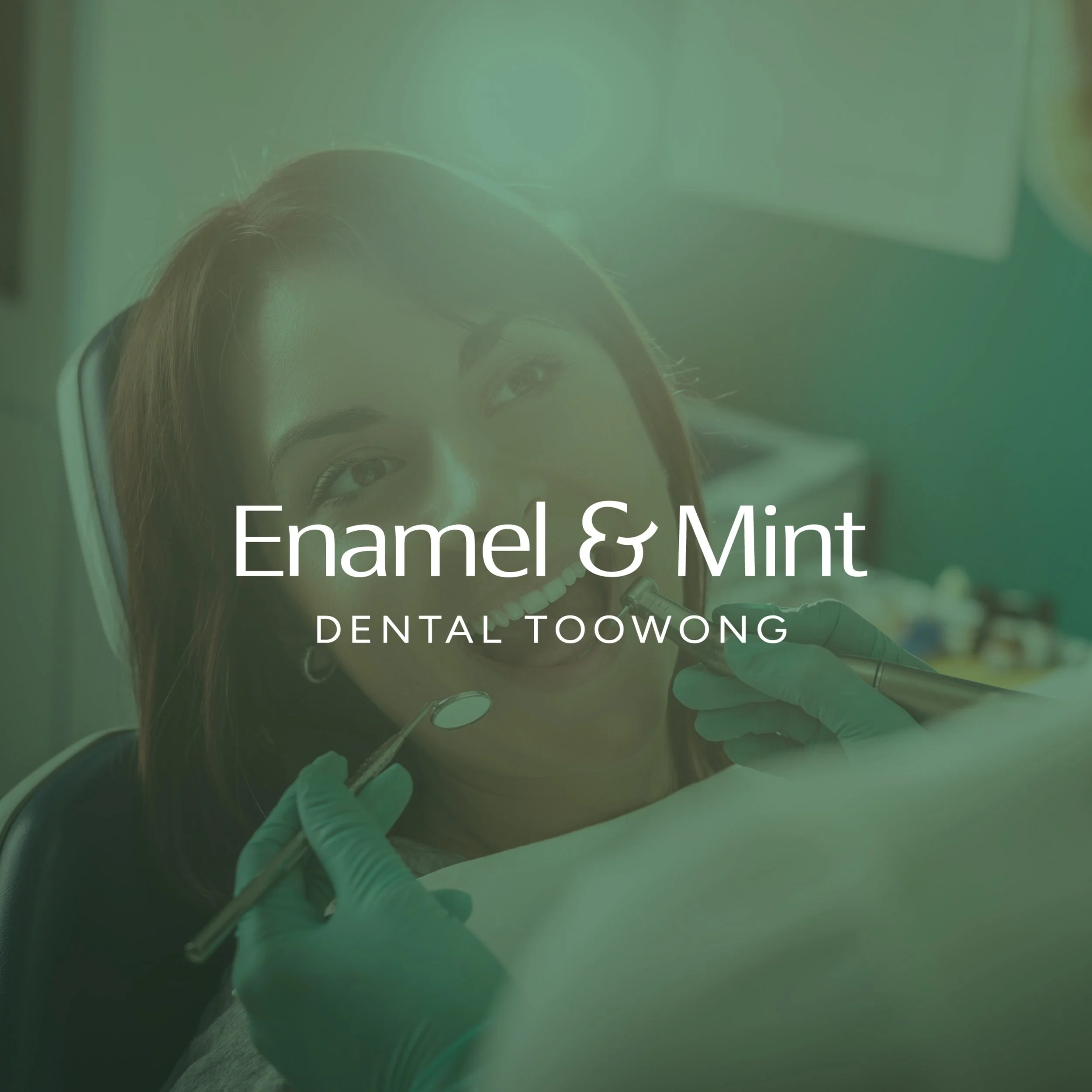
Branding for a Brisbane Dental Clinic
Enamel & Mint is a new dental practice on Milton Road in Toowong, Brisbane. As a practice preparing to open its doors, Enamel & Mint needed a complete brand identity that felt warm, modern and genuinely welcoming, a world away from the clinical, corporate feel of the larger dental chains.
They approached So Swell Studio for brand identity design that felt fresh and considered while signalling quality and trust, positioning Enamel & Mint as the kind of neighbourhood dentist a family actually looks forward to visiting.
The Challenge
Launching a new dental practice means earning trust before a single patient walks through the door, and the brand has to do much of that work.
For Enamel & Mint, the priorities were clear:
Develop a distinctive brand identity that felt modern without being corporate
Signal dentistry without leaning on the commonly used clichés of the industry (toothy stuff)
Create warm, clear positioning built around preventative care and long term relationships
Draw the palette from the name and practice interior so it all felt connected
Build a flexible system ready to grow across signage, print and social
The brand needed to feel calm and welcoming while still standing apart in a competitive local market.
Our Approach
The project began with strategy, getting a clear picture of who Enamel & Mint is, who they are speaking to, and where they are headed. That foundation shaped every design decision that followed.
The project included:
Brand strategy and direction
Logo design and brand system
Colour palette and typography
Brand patterns and social graphics
Complete brand guidelines
Each element was designed to create a cohesive and considered brand experience.
Brand Identity Design
The Enamel & Mint identity centres on a custom ampersand, with a subtle smile worked into the mark. It is a nod to dentistry that deliberately sidesteps the literal tooth so many dental brands reach for, giving the practice a mark that feels designed rather than generic.
We paired it with a soft palette led by House Mint, a sage green drawn directly from the practice interior, balanced with warm cream and a grounding deep green. Relaxed, considered typography keeps the system feeling calm and premium, with a flexible foundation that grows with the practice over time.
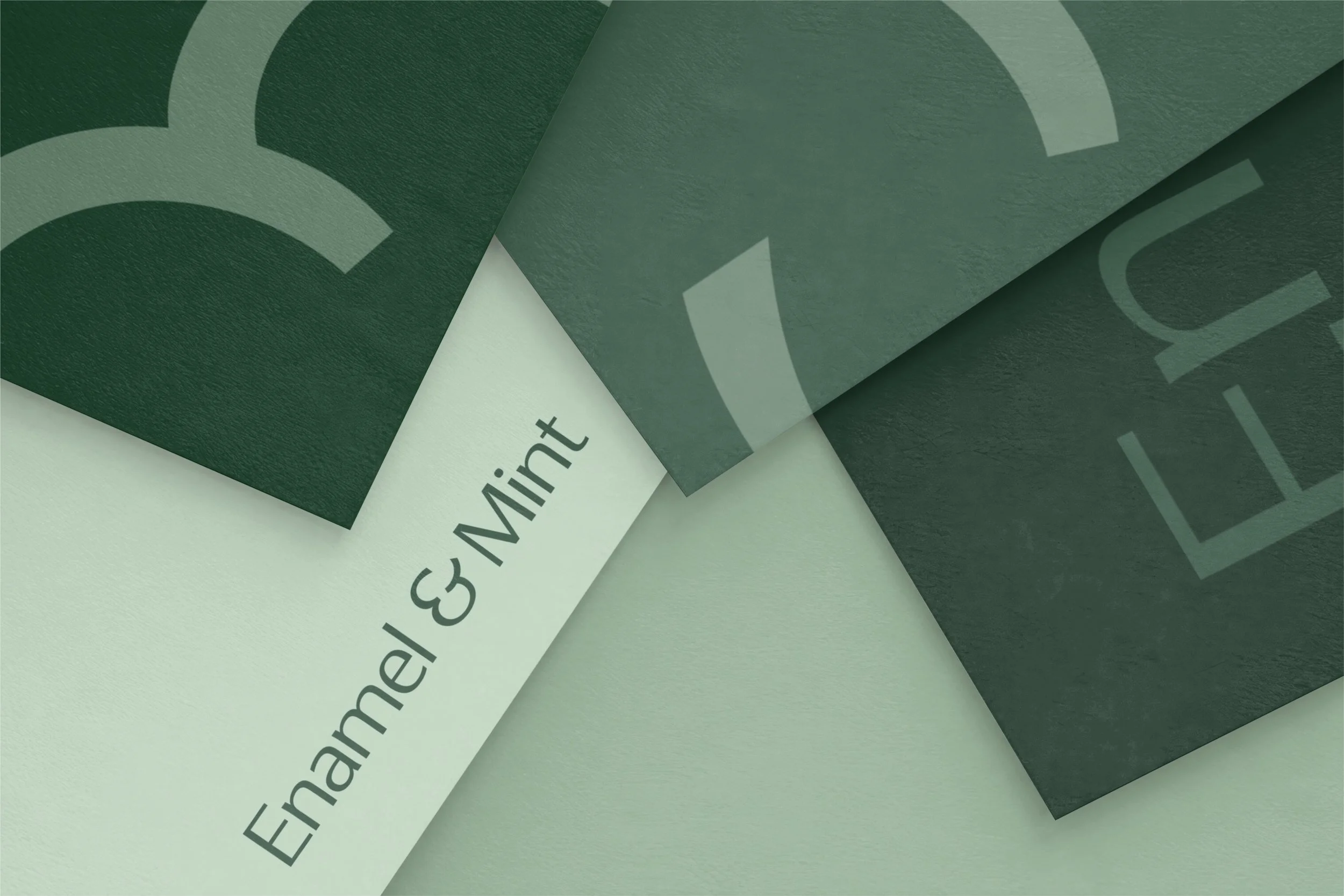
A Brand That Reads as Dental Without the Clichés
Rather than relying on a literal icon, Enamel & Mint communicates what it does through a considered identity, warm photography, clear copy and a supporting set of brand graphics. The result is a practice that feels unmistakably like a dentist, but a modern, welcoming one, and never generic.
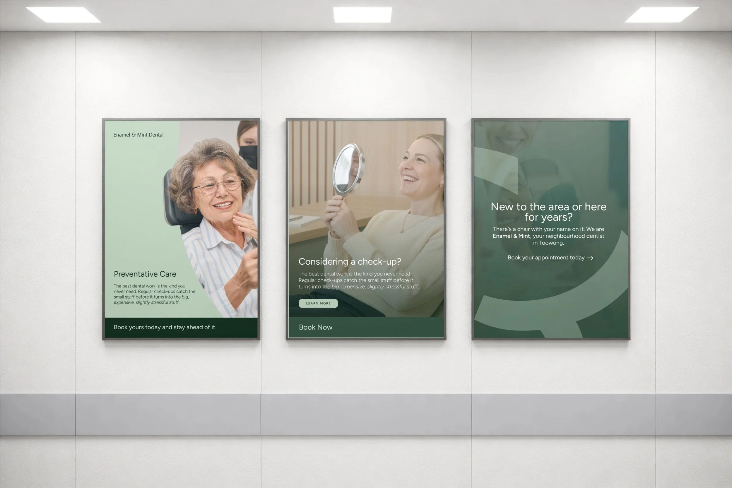
The Outcome
Enamel & Mint is set to open with a brand identity that feels local and quality in equal measure, tied closely to the practice's space and ready for whatever comes next, from signage and print through to social. For a practice built around how patients feel, it mattered that the brand felt just as considered.
Services Provided
Brand Strategy
Brand Identity Design
Logo Design
Colour Palette & Typography
Brand Guidelines
Thinking About Launching a New Brand?
Launching a thoughtful brand identity sets the foundation for how your business is perceived and how customers experience your brand online.
At So Swell Studio, we work with service based and ecommerce businesses to create strategic brand identities and websites designed to support long term growth.
Explore our branding services or book a discovery call to start creating a brand that reflects your vision.
